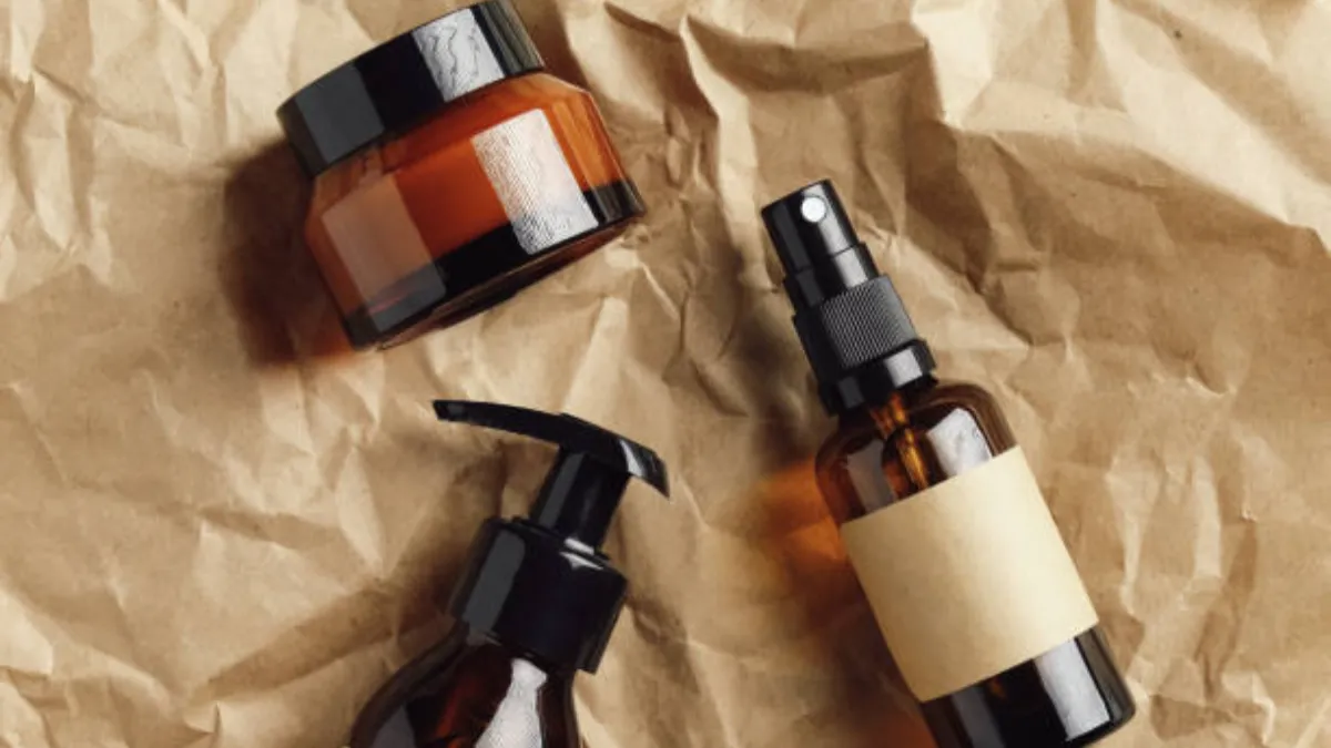
A cosmetic jar label is more than a sticker—it’s the first visual and tactile cue that tells customers what your brand stands for. The right material and finish can make a jar feel modern and premium in the hand, reduce glare for cleaner readability, and create the kind of shelf presence that looks just as good in studio photos as it does under retail lighting.
In this guide, we’ll walk through how to choose label materials, finishes like matte vs. gloss vs. soft-touch, and the specs that help your design stay flawless through handling, moisture, and real-world use.
How to Choose Labels That Look Premium on Cosmetic Jars
In beauty, packaging is the silent salesperson. Before anyone feels the cream texture or reads your ingredient story, they see the jar and they touch it. Your label is where that first “this looks expensive” moment happens—or where it gets lost. Premium labeling is less about adding complexity and more about choosing the right combination of surface finish, ink/foil effects, and restraint in layout. Custom labels for cosmetic jars can elevate your brand’s perception, making even a simple jar feel more refined.
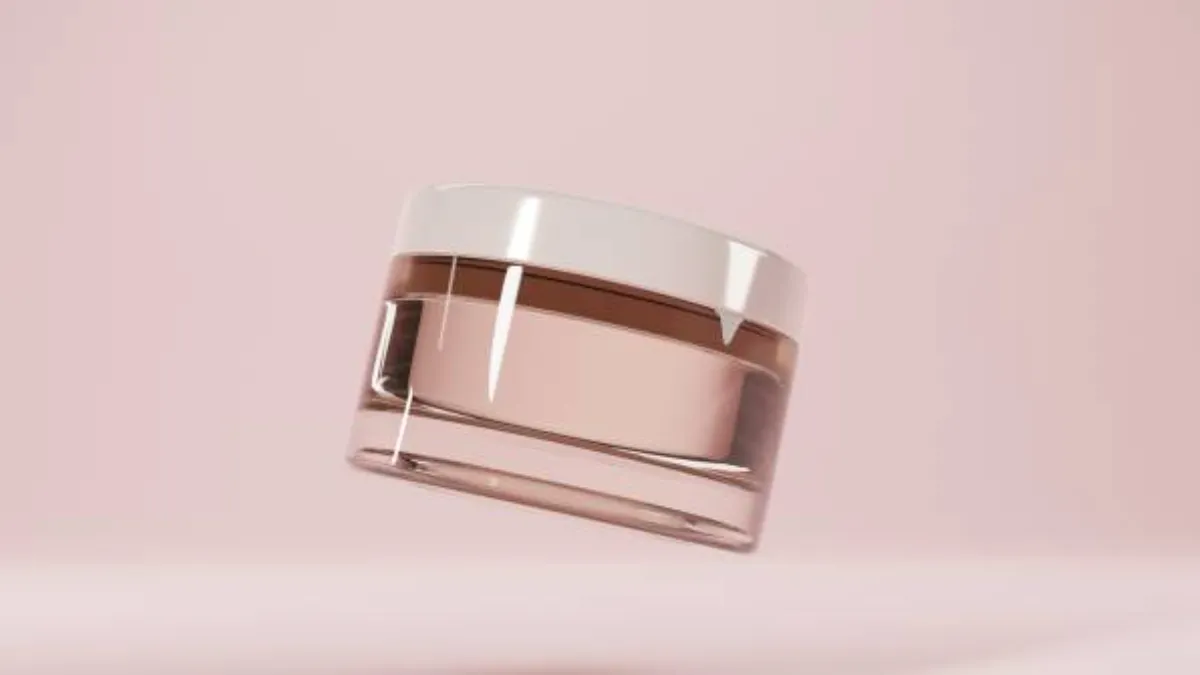
A premium look usually comes from three things working together: controlled shine (or deliberately reduced shine), high legibility, and clean alignment on the container. When the label reflects light in unpredictable ways, shows wrinkles, or slightly lifts at the edge, customers read it as “mass-market” even if the formula is excellent. Conversely, a well-fitted matte or soft-touch label with sharp type and consistent placement makes even a simple jar feel elevated.
Label Materials That Match Your Formula (Paper vs Film)
Once the brand look is clear, material choice becomes the foundation of performance. Cosmetic jars face oils, wet hands, condensation, and abrasion—so the label material must match both the formula and the usage scenario.
Label material usually comes down to paper vs film:
- Paper labels: Premium, natural look; higher risk in moisture/oil environments unless protected.
- Film labels (BOPP/PP/PE/PET/vinyl): Better water/oil resistance; often the safer default for bathroom products and oil-based formulas.
Best label materials for oils, moisture, and bathroom use
Dry-use products (powders, some creams used away from water): Paper can work if you add a suitable varnish/lamination and test for handling wear.
Oil-heavy formulas (balms, facial oils, body butters): Prefer film + “greasy surface” adhesive.
Wet-use environments (shower/bathroom): Prefer film + protective topcoat to prevent edge lifting and scuffing.
Adhesives & laminates that prevent lifting and smudging
- Choose an adhesive rated for glass/smooth surfaces (and test if glass is frosted/coated).
- Add laminate/varnish if you expect frequent handling (reduces scuffing and ink rub).
- If your design uses fine text or deep blacks, topcoats help maintain “new jar” appearance longer.
Material decision guide (use this as a skimmable block):
| Your product reality | Recommended face stock | Finish/topcoat suggestion | Why it helps |
|---|---|---|---|
| Oil-based formulas (balms, oils) | Film | Matte or gloss laminate | Resists oil contact; protects ink from smearing |
| Bathroom humidity / wet hands | Film | Laminate + strong edge adhesion | Reduces wrinkling, corner lift, and scuffing |
| “Natural” look, low moisture exposure | Paper | Matte varnish/laminate | Keeps premium paper feel while improving durability |
| Very small jars with dense info | Film or paper (space-driven) | Matte laminate | Better readability, less glare, cleaner typography |
Label Finishes: Matte vs Gloss vs Soft-Touch
Finish is where premium positioning becomes visible. Two jars can use the same artwork and still look completely different depending on how the surface handles light and touch.
Gloss vs matte—shelf impact and readability
- Gloss: Higher shine, more “pop” under strong lighting; can introduce glare and reduce readability on small text.
- Matte: Lower glare, calmer look; often reads more refined and supports minimalist luxury layouts.
Soft-touch—luxury feel without visual noise
Soft-touch adds a velvety tactile layer that signals premium the moment someone holds the jar.
- Best for: Minimalist typography, monochrome palettes, “quiet luxury” positioning.
- Works well with: Selective accents (foil/spot gloss), because the base feels elevated already.
- Watch-outs: Over-stacking effects can feel busy; soft-touch usually looks best with restraint.
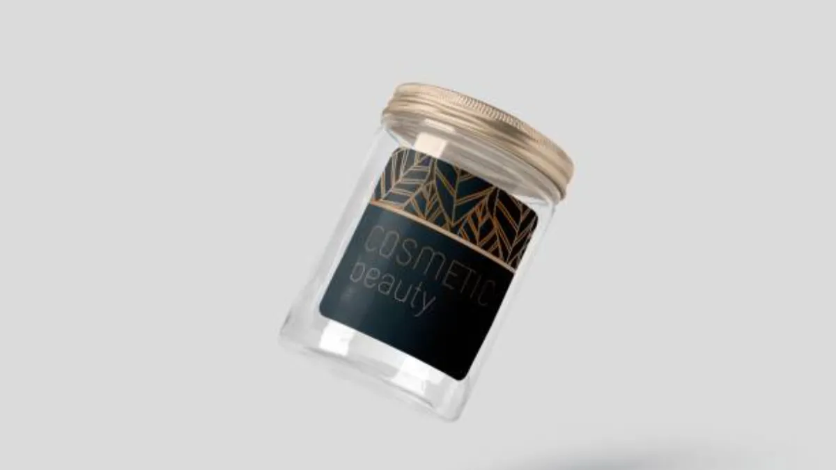
When a “no-label” look wins: frosted glass & minimal branding
Sometimes the most premium label strategy is to reduce the label altogether. If your brand is aiming for a seamless, “designed object” aesthetic, you can consider a no-label look using direct-to-glass decoration such as frosting, screen printing, or subtle hot stamping. Frosted glass can create a permanent matte texture that feels integrated into the jar rather than applied onto it.
This approach is especially effective for high-end skincare and fragrance-adjacent products where the container itself carries brand value. The trade-off is flexibility: changes are harder and often more costly than swapping a label. Still, for hero SKUs or long-term core products, the no-label route can elevate your packaging into a more collectible, premium experience.
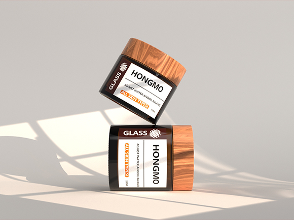
Sizing & Placement for Round vs Square Jars
A premium label is not only about finish, it’s also about fit. Poor sizing leads to wrinkles, bubbles, edge lifting, or misalignment, all of which instantly signal “low quality.” The best luxury design can be ruined by a label that’s 2–3 mm too wide or placed inconsistently from jar to jar.
The sizing method depends on jar shape. Round jars generally require wrap calculations and careful control of overlap. Square jars introduce panel logic: you can use the flat faces as structured zones for information and branding, creating a cleaner and more deliberate layout.
How to measure for wrap labels
For round jars, label width is typically based on the jar’s circumference at the application area. You can measure circumference directly using a flexible tape, or measure diameter and calculate circumference. Once you have the full circumference, leave a small “pro gap” so the label ends don’t overlap. Overlap looks amateur and often causes edge lifting over time.
Height matters just as much as width. Don’t size the label so close to jar shoulders or curves that application becomes inconsistent. Leave breathing room near transitions, because curves and radii can cause labels to wrinkle or distort during application, especially on high-speed lines.
Square jars—using panels for a cleaner layout
Square jars can be a branding advantage because they give you natural “panels.” Instead of forcing everything into a continuous wrap design, you can place your logo and product name on the front panel, dedicate another panel to benefits or usage directions, and reserve the back for ingredients and regulatory info.
This structured layout tends to feel premium because it’s organized and easy to scan. It also reduces the risk of your ingredient list crowding the hero face of the jar. If you’re aiming for a luxury look, a square jar with a clean panel-based label strategy often appears more architectural and intentional than a busy wraparound.
Compliance Essentials for US & EU Cosmetic Labels
Core label elements
At minimum, plan space for: product identity (what it is), net quantity of contents, ingredient declaration, and responsible party/business information. For cosmetics, ingredient lists must be handled with care—both for regulatory expectations and for consumer trust. Many premium brands also include usage directions, PAO (period after opening) symbols where appropriate, and necessary warnings, depending on product category.
Because space is limited on jars, especially smaller sizes, you may need creative solutions like peel-back labels, outer cartons, or pairing minimal front labels with secondary packaging. But even if you use an outer box, the jar often still needs core information depending on the market and distribution model—so don’t assume the carton solves everything.
Material safety for global markets (REACH/RoHS)
If you’re exporting or selling across regions, material compliance can also matter—especially if your packaging includes coatings, inks, adhesives, or decorative treatments beyond a basic label. REACH and RoHS are commonly referenced frameworks in broader product compliance and supply chain requirements, and many brands use compliant materials as part of their safety and sustainability positioning.
From a brand standpoint, this isn’t just “paperwork.” Being able to state that your packaging materials meet relevant safety expectations supports consumer trust and reduces friction when you scale into larger retail channels that require supplier documentation.
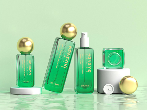
Labels vs Direct Printing: Which Delivers a Better Premium Finish?
If your goal is premium aesthetics, the decision is not simply “labels are cheaper” or “printing is better.” Each method has strengths. Labels excel at high-detail graphics, multi-finish effects, and flexibility for SKU changes. Direct printing and other direct-to-container decorations excel at seamless integration and recyclability benefits (depending on materials and local recycling rules).
A smart brand strategy often uses both: custom labels for cosmetic jars for fast-moving SKUs and variants, direct decoration for hero products, limited collections, or signature lines where the container itself becomes a brand asset.
Cost, durability, design flexibility
Use this quick comparison to guide the decision:
| Factor | Labels | Direct printing / direct-to-container |
|---|---|---|
| Design detail (gradients, dense graphics) | Strong | More limited |
| Finish options (soft-touch, laminates, effects) | Strong | Depends on method |
| Durability in handling | Strong with laminate | Often strong; method-dependent |
| SKU changes / seasonal variants | Easy (swap label) | Harder (setup changes) |
| Premium “integrated” look | Good | Excellent when executed well |
Decoration options: screen printing, hot stamping, decals
For premium looks, you’ll commonly see:
- Screen printing for crisp, durable graphics and a clean, integrated feel.
- Hot stamping for metallic accents (gold/silver) that read luxury immediately.
- Water-transfer decals for complex shapes and a more “painted-on” look.
Each technique has its own tolerances and production requirements, so the best approach is to decide what “premium cue” matters most for your brand: metallic highlights, tactile softness, ultra-minimal integration, or high-detail storytelling graphics.
Scaling to Production Without Compromising Aesthetics
Many brands create a gorgeous prototype, then lose the premium look at scale due to inconsistent application. Luxury is about consistency: every jar should look identical on shelf and in customer hands. Scaling is where tolerances, application repeatability, and production workflow start to matter as much as design.
If your label placement shifts from jar to jar, your typography alignment becomes a quality issue. If corners lift after shipping, your unboxing experience suffers. The goal is to design and source labels that remain stable, apply cleanly, and maintain appearance through logistics and daily use.
Launch Faster with Custom Glass Packaging
Frequently Asked Questions
Can you do gold foil on glass?
Metallic foil effects on glass usually require a proper process and surface preparation rather than simply “sticking foil” onto bare glass. In practice, premium foil looks best when it’s done through established decoration workflows (like hot stamping with primers or compatible adhesives). If foil is central to your brand identity, treat it as a technical decision early—because it can influence your container finish, artwork, and production partners.
Is screen printing more expensive than labels?
It depends on volume, number of colors, and how complex your design is. Screen printing can have higher setup costs but can become cost-effective per unit at larger runs, especially for simpler designs. Labels tend to be more flexible for frequent SKU changes, seasonal versions, and multi-language expansions.
How to remove labels from glass jars
For practical removal, soaking methods and adhesive softening (using alcohol-based solutions, heat, or oils to remove residue) are commonly used. If your brand sells refill systems or encourages reuse, it may be worth choosing label materials and adhesives that balance durability with removability—so customers can repurpose jars cleanly.
What are water-transfer decals?
Water-transfer decals are thin designs that can be applied to curved surfaces to create a seamless, painted-on look without the raised edge of a typical label. They’re often used when you want high-end aesthetics on shapes that are difficult to label cleanly.
Do label suppliers provide design services?
Many label suppliers offer design support, from dielines and print-prep to full creative services. Even if you have an in-house designer, supplier prepress checks are valuable because they catch issues like unreadable small type, insufficient bleed, or finish choices that won’t reproduce well at scale.